Color Wheel Harmony: Picking Palettes That Actually Work
What complementary, analogous, and triadic schemes really mean, plus a practical way to turn one brand color into a full UI palette.
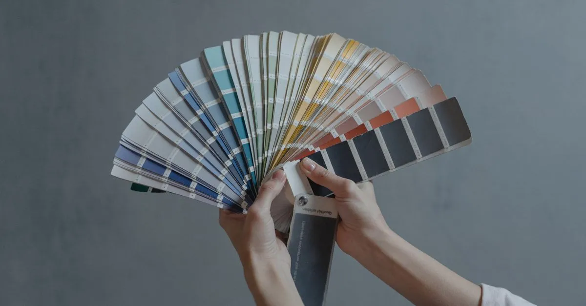
Most developers can build a whole app but freeze when asked to pick a second color. The first one is easy — the brand already has a blue, or you just like teal. It’s color number two that goes wrong, and you end up with a dashboard where the warning orange clashes with everything around it.
The Color Palette Generator handles this with math that painters worked out long before CSS existed: rotate around the color wheel by fixed angles, and the results tend to sit well together.
The five rules, in plain terms
Each scheme is just a set of positions on the wheel, measured in degrees of hue:
- Complementary — the color directly opposite, 180° away. Blue gets orange. Maximum contrast, which is why film posters lean so hard on teal-and-orange.
- Analogous — the two neighbors, 30° to each side. Blue gets blue-violet and cyan. Calm, low-tension, good for backgrounds.
- Triadic — three hues 120° apart. Balanced but lively; think classic superhero costumes.
- Tetradic — four hues at 90° intervals. The hardest to control, best when one color clearly dominates.
- Monochromatic — one hue, several lightness steps. Impossible to get wrong, occasionally boring.
Take #3b82f6, the default blue in the tool. Its hue is 217°. Rotate 180° and you land near 37° — a warm amber. Nobody chose that pairing aesthetically; it fell out of the arithmetic, and it still looks deliberate.
From one color to a working UI palette
A harmony rule gives you hues. It doesn’t tell you where to put them. The distribution most designers reach for is 60-30-10, borrowed from interior design: about 60% of the screen in a neutral or your base color’s palest tint, 30% in the base color itself, and 10% in the accent.
That 10% is where the complementary color earns its keep. An orange button on a blue-dominated page draws the eye precisely because it appears nowhere else. Spread the same orange across headers, borders, and icons and the effect dies — now it’s just a loud page.
For the in-between shades (hover states, borders, disabled text), generate a monochromatic run of your base and pick from it. Five lightness steps cover most of what a small project needs.
Where hue rotation lies to you
One honest caveat. HSL treats all hues as equals, but your eyes don’t. Yellow at 50% lightness looks far brighter than blue at 50% lightness, because human vision is simply more sensitive around green-yellow. So a triadic palette built from a mid-tone blue can hand you a yellow that reads as neon next to its siblings.
The fix is manual and quick: after generating, nudge the lightness of any color that visually shouts. (This is the problem newer color spaces like OKLCH were designed to solve, but the classic wheel math still runs on HSL, and for palette sketching it’s plenty.)
Also check contrast before shipping. A gorgeous analogous pair can still fail WCAG when one sits on the other as text — the swatches show HSL values, so you can spot two colors with nearly identical lightness at a glance.
Try it on your own brand color
Grab whatever HEX code your project already uses, paste it into the Color Palette Generator, and flip through the five schemes. Copy the codes you like — each swatch gives you HEX, RGB, and HSL with one click.